Saturday, July 26, 2014

Organizing Digi-scrap files in Lightroom

This is the process that I use.  It will not work for everyone, but may give you a starting point.  To help me get started I referred to the following resources:
My systems starts with storing my files.  I have them in one main folder, then separated by designer, then by kit.  I am mainly a kit scrapper and this works well for me, but would also work for a pick and choose scrapper.

The basis of my system is a Lightroom catalog.  I created a new catalog then added the main folder(s) where I keep my supplies.  This took some time to import as the most current files number around 63 000.  

Once my folder was imported I began by searching out the kit previews.  I did this most efficiently by creating a smart collection with a number of parameters to eliminate files that didn't meet the criteria.  The criteria I used are:
Match all of the following rules
 Short Edge > is less than or equal to > 1000
Long Edge > is greater than > 400
short Edge > is greater than > 400
File Type > is > JPEG
Filename > doesn't contain > small, header, splash, wordart, pira, tou, siggie, thankyou, thanks, thank_you, scrapbook
I then added a keyword for all of the files found labelling them as previews.  There may be files that meet this criteria that ARE NOT previews, but I figure I can look past them or can delete that keyword if they bother me.

The next thing I did was to sort the kit parts.  I created a Collection Set called Element Types.

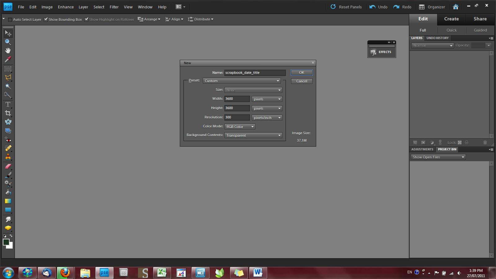
Then I found my papers.  I know that all of the full sized papers I have are 12x12 and either 200 dpi or 300 dpi.  
Within the Element Type Set, I created another Collection Set called Paper, then another within that called 300dpi (since I mainly work in 300 dpi). To find all the 300dpi papers, I used the following Smart Collection Criteria:
Long Edge > is > 3600
File Type > is > JPEG
Aspect Ratio > is > square
I keyworded this collection as paper.  

I also created Smart Collections by colour using the above criterion in addition to colours.  Now we know that designers won't just use the word red for all red papers; they're usually much more descriptive.  So I employed Google to find my synonyms for each colour.  Here's what worked for me:
Black > black, jet, ebony, sable
Blue > sky , azure, cobalt, sapphire, navy, powder, midnight, Prussian, electric, indigo, royal, robin, peacock, ultramarine, aquamarine, steel, slate, cyan, blue
Brown > brown, rust, tan, sepia, hazel, chocolate, coffee, cocoa, nut, mahogany, umber, sienna, beige, buff, fawn, camel, lait, caramel, chestnut
Dots and Spots > dot, spot
Floral > flower, floral
Greens > green, lime, grass, olive, jade, 'pea', emerald, 'sea', leaf (doesn't contain peach, berry)
Greys and Silvers > silver, grey, gray, gunmetal, metal, slate, charcoal, smok
Oranges > orange,tangerine, melon, cantaloupe, coral, peach, titian, gold, cadmium, flame
Paisley > paisley
Pinks > pink, rose, peony, cherry, fuchsia, salmon, coral, blush, 
Purples > purple,lavender, lila, periwinkle, mauve, plum, violet, amethyst, heliotrope, magenta, mulberry, orchid, pomegranate, wine, amaranth, 
Reds > red, cherry, burgundy, wine, vermillion, ruby, cerise, cardinal, carmine, blood, rose, maroon, rufous, cinnamon, 
Striped > strip
Whites > white, ivory, cream, natural, milk, chalk, snow (doesn't contain cranberry)
Yellows > yellow, sun, lemon, sunflower, flax, gold, cadmium, daffodil, mustard, primrose, tawn
I'm sure there are more and I'll add as I go.  I also added a Smart Collection for 200dpi papers, but didn't sort them by colour (yet!)

Next I worked on Smart Collections for elements.  Elements are PNG files so that was one criterion.   The rest are: 
acrylics: match ANY of filename contains acrylic; folder contains acrylic
alphas: match ANY of filename contains upper, lower; folder contains alpha, _a_
animals: filename contains dog, cat, bat, horse, bear, bee, bird, cage, duck, feather, nest, owl, bug, butterfly,caterpillar, cow, deer, dolphin, starfish, dragon, elephant, fish,  frog, toad, giraffe, groundhog, hedgehog, hippo, knagaroo, ladybug, lion, lizard, monkey, mouse, pig, rabbit, sheep, lamb, snail, snake, spider, squirrel, turtle, whale, wolf, worm
bling: filename contains jewel, sequin, charm, pearl, bead, gem; filename doesn't contain alpha
borders: filename contains border
botanicals: filename contains flower, leaf, grass, tree, bark, branch, stick, fruit, orchid, petal, poinsettia, holly, moss, mushroom, nut, seed, pumpkin, vine, 
brushes: filename contains brush
cardboard: filename contains cardboard
clusters: filename contains cluster
dates: folder contains month, year, date; folder doesn't contain alpha, _a_, new start
fasteners: filename contains brad, button, staple, buckle, clip, eyelet, tie, peg, corner, pin, needls, tape, bolt, chain, cog, hinge, hook, rivet, screw, 
frames: filename contains frame, film
journal spots: filename contains journal, tag, card, bookplate
objects: filename contains badge, bag, balloon, ball, basket, bell, blackboard, book, cap, bubble, bucket, camera, candle, clock, clothes, bib, dummy, hat, shoe, sandal, stocking, sunglasses, umprella, tie, hanger, coin, compass, bowl, pot, pan, frig, curtain, doily, doll, angel, fairy, door, earth, postcard, fence, fireplace, rod, flag, food, cake, chocolate, ice, cream, candy, furniture, chair, game, glass, hill, house, castle, jar, vase, bottle, ink, key, kite, light, lamp, lightning, lock, match, ruler, measur, medal, palette, pen, phone, pinwheel, sand, santa, shield, skull, snowman, stone, sword, toy, tire, fork, knife, spoon, can, varrow, windmill, window, wreath, 
overlays: filename contains overlay, _o_
paint:  filename contains paint
pieces and rips: filename contains fabric, fold, label, mat, strip, piece, pocket, tab, torn; filename doesn't contain word, alpha; folder doesn't contain word, alpha, _a_
ribbons and string: filename contains ribbon, string, bow, elastic, rubber, fabric, lace, curl, raffia, ric rac, ricrac, rope, ric_rac, tassel, twill, wool, twine
shapes: filename contains anchor, arrow, bracket, circle, cloud, cross, crown, drop, egg, fleur, footprint, gate, handprint, heart, horseshoe, jigsaw, lip, moon, music, sun, paisley, plane, card, postage, present, gift, rainbow, robot, scissors, snowflake, speeh, square, rectangle, star, straw, ticket, triange, wand, wave, wing, 
splats: filename contains Fireworks, paint, stain, sprinkle, water, splash, 
stamps: filename contains stamp
stickers: filename contains sticker
stitching: filename contains stitch, thread
swirls and flourishes: filename contains swirl, flourish
transportation: filename contains bike, boat, 'sign', 'car', plane, helicopter, rocket, train, truck
wordart: filename contains word, _w_; filename doesn't contain upper, lower, alpha
Now to USE the catalog with my scrapping style, I start with the photo.  I open it in PS, make any edits, then choose one main colour from the photo to work with.  For example, with a photo using red, purple, white and pink, I started with purple thinking I would find a kit with either purple and red or purple and pink.  

In my Smart Collections, I clicked on the purple papers.  I selected one that looked promising, then right clicked to open in Explorer (Windows).  I didn't like the 'fit' of the first kit, so I repeated the process two mor time before finding a kit that PERFECTLY matched!  I then used the open Explorer window with PS to create the layout.  

I hope this helps you if you want to organize your digi files.  Please let me know if you find anything that works for you!

Thursday, August 23, 2012

So you want to create a 2-pager...

...but you don't know how you would save it to be able to print.  This is something I struggled with too when I started using PSE, so you are not alone.  There are many, many ways to go about creating and saving a double-wide layout, but here is the one that I use.

Start by creating a 2 page layout.  I do this as a single file that is 12"x24" and 300 dpi.  If you need to know how to do this, see my post on how to create a new layout.  I save this file as a full 12"x24" 2-page layout so that I don't have to worry about finding the separate sides if I make a mistake. 

Now I begin my process of saving the individual pages.  First select the Rectangular Marquee tool (M) and select Fixed size from the drop-down menu on the tool bar.

Enter 12in into each of the boxes in the toolbar.
Now click into your layout and slide the marching ants to the left hand side of your layout until it doesn't move anymore.  
 Go to Image>Crop.  This will crop your image to just the left hand side.
Now save your image as a jpg and make sure to label it as the left hand side. This is a good time to also save for the web in your usual way.
 
Now press Ctrl+Z to undo the crop and move the marquee to the right hand side.  You shouldn't have to press anything to be able to move the marquee, but if you are having trouble, press Esc to deselect and then reselect as above.  Crop and save the same as before. 

I hope this helps you create more 2-page layouts.  They are quite fun to do!

Thursday, August 9, 2012

I haven't forgotten

I haven't forgotten about you all, I've just been busy planning a secret vacation.  We surprised our 2 young boys with a Disneyland trip and just got back.  I'll try to get a few new posts together soon!

Tuesday, July 3, 2012

How to Capture Firelight Photos

Do you ever stay up late roasting marshmallows in the dark? Have you ever had a bonfire so big and hot that you could see perfectly clearly, if a little orange? Do you add those little color packets to your fire to get interesting colors?


What is it about fire that you want to remember and maybe add to your scrapbook? Is it the patterns the sparks make as they rise from the flames? Is it the dancing of the flames? Is it the amazing variety of color? Whatever your reasons for taking a fireside photo, you need to have the techniques to do it effectively.

I love taking photos of fire for two reasons. First, it stretches my photography skills and I learn something new every time I try. Second, it seems to be a big part of every camping trip and deserves to be documented.

Taking fire photos isn’t as easy as it may look. While there might seem to be a lot of light, your camera may not see it the same way you do. And your camera certainly doesn’t see the motion of the fire the same as you do. It’s then your job as the photographer to tell the camera how to see.
Let’s look at a few examples.


If you’re using a point-and-shoot camera, your first reaction may be to put your camera into night mode. After all, it’s dark outside, right? Yes, it’s night but what happens to your camera in night mode? Because your camera expects a low light situation when you tell it to work in night mode, it opens the aperture up all the way, thereby creating a shallow depth of field. It also slows down the shutter speed to allow more time for the light to hit the sensor, thus creating the opportunity for blur to appear in your scene. Usually, you would use a tripod at night to reduce blur but because the fire is constantly moving, you won’t be able to prevent it. The end result of using night mode on a campfire is that you’ll get a lovely photo of a blurry campfire.

Instead, if you want to remember some of the details of the fire like the hole that keeps popping open or the flash of green from the piece of copper pie, then you’ll need to do something different with your camera. You could try sport mode, as it does the opposite of night mode, but your fire is probably too dark for that. You could try portrait mode as it will open the aperture but only have a medium shutter speed. This option would capture more details than night mode, but it may not be enough.

1/80s shutter speed

1/250s shutter speed

The real trick to capturing a great fire photo with all of the shadows that come from the flames is to use one of the creative modes. These are Aperture, Shutter Speed or Program modes. Ideally, what you want to do is open the aperture to let the light in, but keep a faster shutter speed to freeze the motion. You may need to increase the ISO (sensor sensitivity) of your camera to get good exposure. I prefer to work in shutter speed mode because I’m usually taking photos of my kids, and the same principles apply to fire. They’re both constantly moving, so you need a faster shutter speed to capture the details. I generally try between 1/60 and 1/15000 of a second for my fires. It really depends on the fire. The difference between 1/80 and 1/250 of a second is clear in these photos.

1/1000s shutter speed

And when you bump up to 1/1000 of a second, wow!
What about some more creative photos? I love to take photos of sparks and I have some pretty fun photos to show for it.


If you want to try some of these photos, here’s what I usually do: I put the camera into Shutter Speed or Program mode and set the shutter to stay open for three to ten seconds. I then focus and open the shutter. While the shutter is open, I’ll play around with moving the camera in different directions and patterns. Depending on the light from your fire, you may need more or less open time.

Wednesday, May 30, 2012

Sketch It!

For some people, part of the fun of scrapping is finding new and inventive ways to share photos.  And we find inspiration for these ways in a variety of places including art, and in the case of this tutorial, graphic art.  For the June 2012 Stylelift Challenge, we are inspired by the work of Nikki Farquharson's Mixed Media Girls.


To create the sketched look, we can use Photoshop Elements. First choose and open an image that has a clear main subject. Duplicate the background layer by pressing Ctrl+J or dragging the thumbnail to the new layer icon at the bottom of the layers palette.
Turn this layer to black and white by going to Enhance > Adjust Color > Remove Color.

Then, apply the filter, Glowing Edges.
Depending on the size of your image, you will need to adjust the settings to get the edges well highlighted.


Next, invert the layer by pressing Ctrl+I.
Now we need to get rid of some of those greys, so add a threshold adjustment layer.
Adjust the slider so that your edges are clear.

I hope this tutorial has given you some inspiration to play with your photos.

Saturday, May 5, 2012

Polygons and a Math Lesson

Have you ever wanted to try cutting a paper into something other than a square, rectangle or circle?  Sometimes it's a nice, refreshing change.  Today, I'll show you how to create the matting in this layout.

Friends Are page kit by Erica Belton


To create this look, we are going to use the polygon tool.  It is located with a whole bunch of other tools, including rectangle, rounded rectangle and custom shape.

The polygon tool is located under the Rectangle Tool
When you are ready to add a polygon to your layout, right click on whichever of these tools is on top and select the polygon tool, or cycle through them by pressing the U key.  In the toolbar, choose the number of sides you want for your polygon.  The higher the number, the more circular it will look.  I chose 10, which was also an easy number for the math part of the lesson.

Enter the number of sides you want for your polygon.
 To draw the polygon, drag your mouse from the centre of your layout to the side.  This tool is different from most of the others in that you always start at the centre.  The angle you move your mouse at will determine the rotation of the polygon.  I want the sides of my bottom layer to be vertical so I am watching for that when I draw my polygon.  The other option is to press Shift while drawing and that will keep the top side horizontal and then you can rotate it after the fact. 

Draw your polygon from the centre out.  Keep an eye on the sides if you prefer things to be square to your page sides.

Now add your bottom paper to the layout.  Ctrl+Click on the polygon thumbnail and add a layer mask to the paper.

Add paper, Ctrl+Click on polygon thumbnail, then add layer mask.

Back on your polygon layer, you need to rotate it for the next paper.  Here's your math lesson.  There are 360° in a circle.  Divide that number by the number of sides in your polygon.  For a decagon (10 sides) you get 36°.  Now divide that answer by the number of papers you want to stack.  For this layout, I want 3 papers, so I will divide by 3 to get 12°.  That mean that I need to rotate my shape layer by 12°.  I will do that by making sure that layer is active and then pressing Ctrl+T and entering 12 into the rotation box.

Rotate shape by 360° ÷ # of sides ÷ # of papers

Now repeat adding your next paper, applying a layer mask and rotating the polygon until all of your papers have been added.  Add drop shadows and you're done!  That wasn't so bad now, was it?  You can delete your shape layer if you like, but it won't show so it's up to you.

Don't forget to rotate your shape for each additional paper

I hope you enjoyed this tutorial. As always, please let me know if there are any techniques you would like to learn or if you have questions.

Wednesday, April 18, 2012

New to Photoshop Elements? Make a layout now!


I'm often asked by new digi-scrappers how to get started in Photoshop Elements.  I hope this quick tutorial helps!

Open a new file.

Choose settings of 3600x3600 pixels for a 300 dpi page, or 2400x2400 for a 200dpi page.  This is your choice based on which products you purchase.  Print quality is 240dpi, but most people don’t notice any degradation in quality using 200 dpi products.  For 200dpi file sizes are much smaller so if hard drive space is an issue you may want to go that route. I always name my files as scrapbook_date_title so that they are easy to find and sort by chronological order. I use the date of the photo, not the current date as that is already stored in the computer when you save. Click OK.

Press Ctrl+O or File>Open and browse to the page kit you want to use.  Open the BGs and Elements. These are the graphics of the kit.  Also open the photos you want to use.  You will see all of these items in your project bin, usually at the bottom of your page.

Drag your kit pieces into your empty file from the project bin.  Some people will copy and paste them, but if you drag them in, you retain the file names and that’s helpful when writing your credits.  Everything you drag in will show in your layers palette on the side of your screen.  Think of the layers as all of the layers in a paper scrapbook page.  They show from the top to the bottom.

If you want to resize or rotate an item, make sure you have your move tool selected.  It’s the top one in the column at the left.  The handles of the element make it easy to rotate or resize.  Try not to use the side handles, only the corner ones to avoid distorting things.


Add text with the text tool.  PSE uses all of the fonts installed on your computer. 

Save as a jpg for printing and as a psd for future edits.  I hope that helps!